Home
Why Your Website Doesn't Need a Navbar?
Table of Content:
Tomorrow marks 4 weeks of this site and so I thought I'd look back at where it is today, where I plan to be in the coming months and why I have no navbar?
The purpose of this site is simple: A place for me to write.
And yet it did not start like that.
I had plans for this to be a personal portfolio site, linking to all my current projects, a place where I could write, potentially an online store, a contact page, a services page... all while looking very modern.
Only 1 problem: I only have a few hours to work on it each week. This is when I decided to focus on what was most important for me - writing.
I simply wanted a place to write.
Focus on the Important Stuff
Once I started on this site, I decided to only build what I needed at the time. Anything I thought would be cool or shiny, I added to the backlog until it was actually required.
Instead of first looking at what I built this month, lets look at everything I decided not to build instead.
You don't need a navbar.
Surprisingly, this site doesn't have a navigation menu. Currently the only "navigation" is from the homepage to a blog and a "back" button from a blog to the home page.
I could have spent time creating a navbar, it would only have taken an hour or so however it would be worthless.
If I let myself build this "feature" then I'll progress to the next small improvement. Maybe it'll be a search bar or better logging or an contact form. However, at the moment with such a small audience - these features would be providing value to nobody.
You don't need lots of pages.
When first building this site, I thought I needed pages for everything:
- An About Page
- Portfolio Showcase
- Contact Form
- Shop or Services
However, this site has 2 pages: Home & Blog.
That's all it needs... for now.
If in the future, a new page will provide value - then I can build. However, for now, all of these would be providing value to nobody.
What you actually need.
Instead of all of this, I have a very basic Next.JS 13 site with a homepage and blogging functionality. The blogs are simply written in markdown (.mdx) and the site has very little customisations other than Code Syntax Highlighting, YouTube Embeds and Markdown tables.
By keeping the site simple, I instead focus on writing the content itself. The reason my old site failed was simply because I focused on what the site looked like rather than what was on the site.
We've all heard it so many times but it's true ... "Content is King".
A great site with no content (and hence no traffic) is worthless.
By removing the distractions (making the site itself look good), I have now been able to focus the last 4 weeks on migrating old content, converting video content to blogs and writing new content for this site.
This is the most content I've written in a long time and it came from focusing on the highest value task in the moment.
4 Weeks Stats
With the focus on content, what are the stats like?
Well, here are the stats so far (4 weeks in), coming from 3 sources:
- Google Analytics
- Vercel Analytics (Provides more data than GA as it doesn't require cookie consent)
- Google Search Console
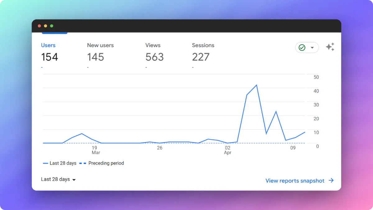
Google Analytics
Key Takeaways:
- 154 Users in 4 weeks
- 563 Page Views
These numbers are slightly below the actual figures as many of the site users will have denied Cookies.

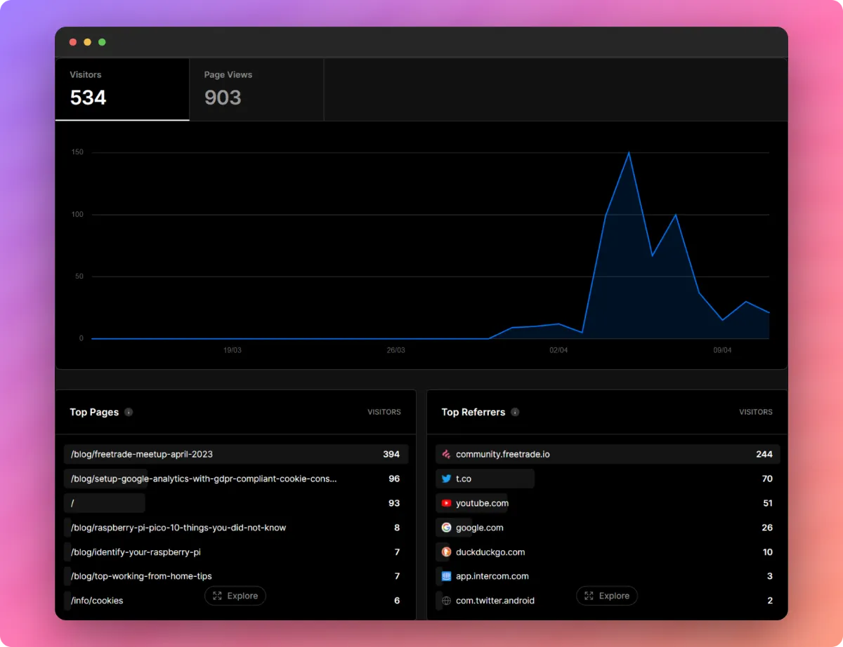
Vercel
These analytics were only turned on 2 weeks ago, but show a more accurate representation of visitor numbers:
- 534 Visitors in 2 weeks
- 903 Page Views

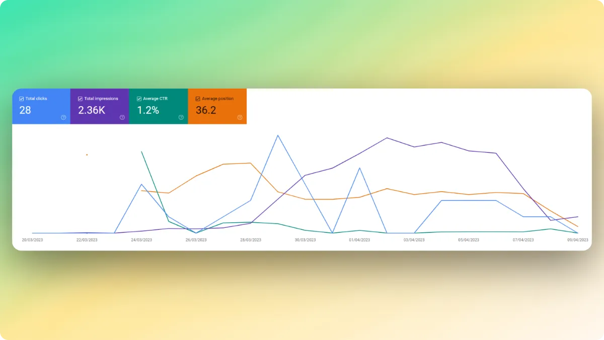
Google Search Console
Figures from Google Search Console:
- 23 Clicks from Organic SEO (Slightly underwhelming)
- 2.36k Impressions from Google
